Aster Canada branding
Aster Canada branding
Aster Canada branding
Role:
Art direction, branding, website design
Client:
AsterCanada, Ontario, Canada
Softwares:
Illustrator, Photoshop, Indesign, Xd
Year:
2023
Role:
Art direction, branding, website design
Client:
AsterCanada, Ontario, Canada
Softwares:
Illustrator, Photoshop, Indesign, Xd
Year:
2023
Role:
Art direction, branding, website design
Client:
AsterCanada, Ontario, Canada
Softwares:
Illustrator, Photoshop, Indesign, Xd
Year:
2023
Overview
ASTERCANADA is committed to delivering healthcare staffing solutions that prioritize convenience and affordability.
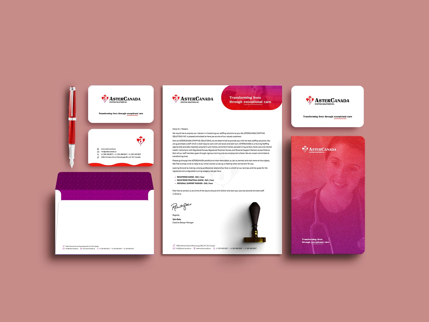
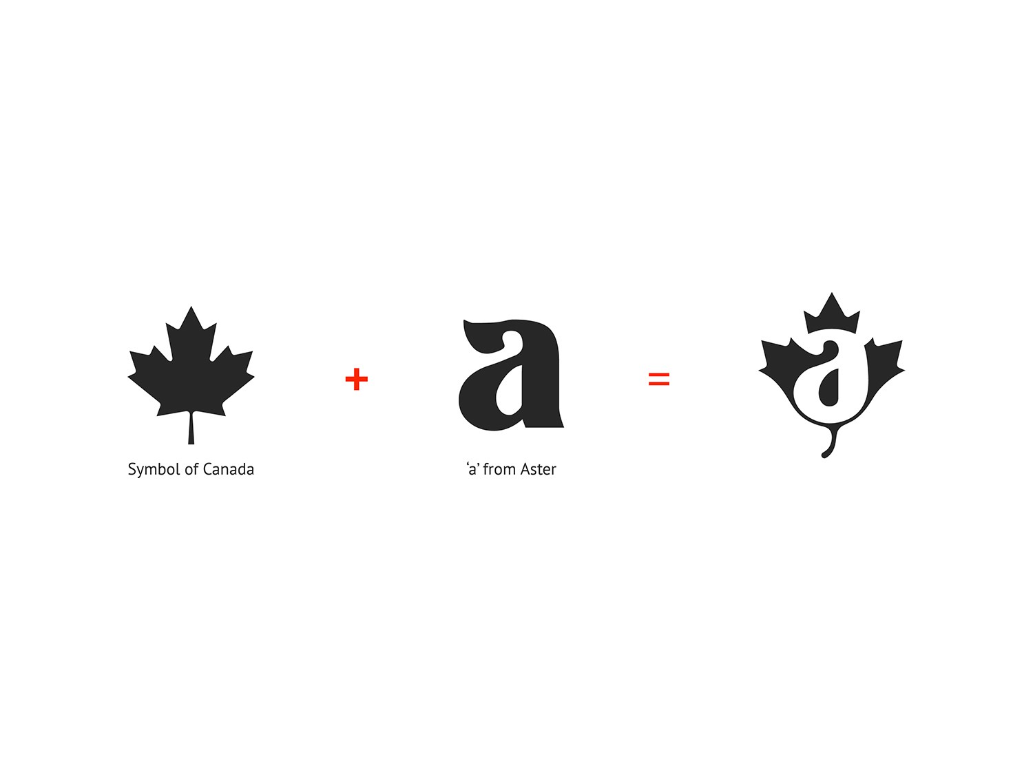
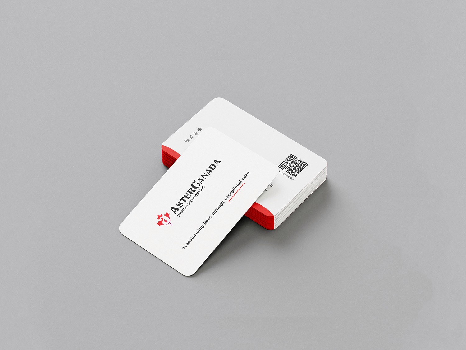
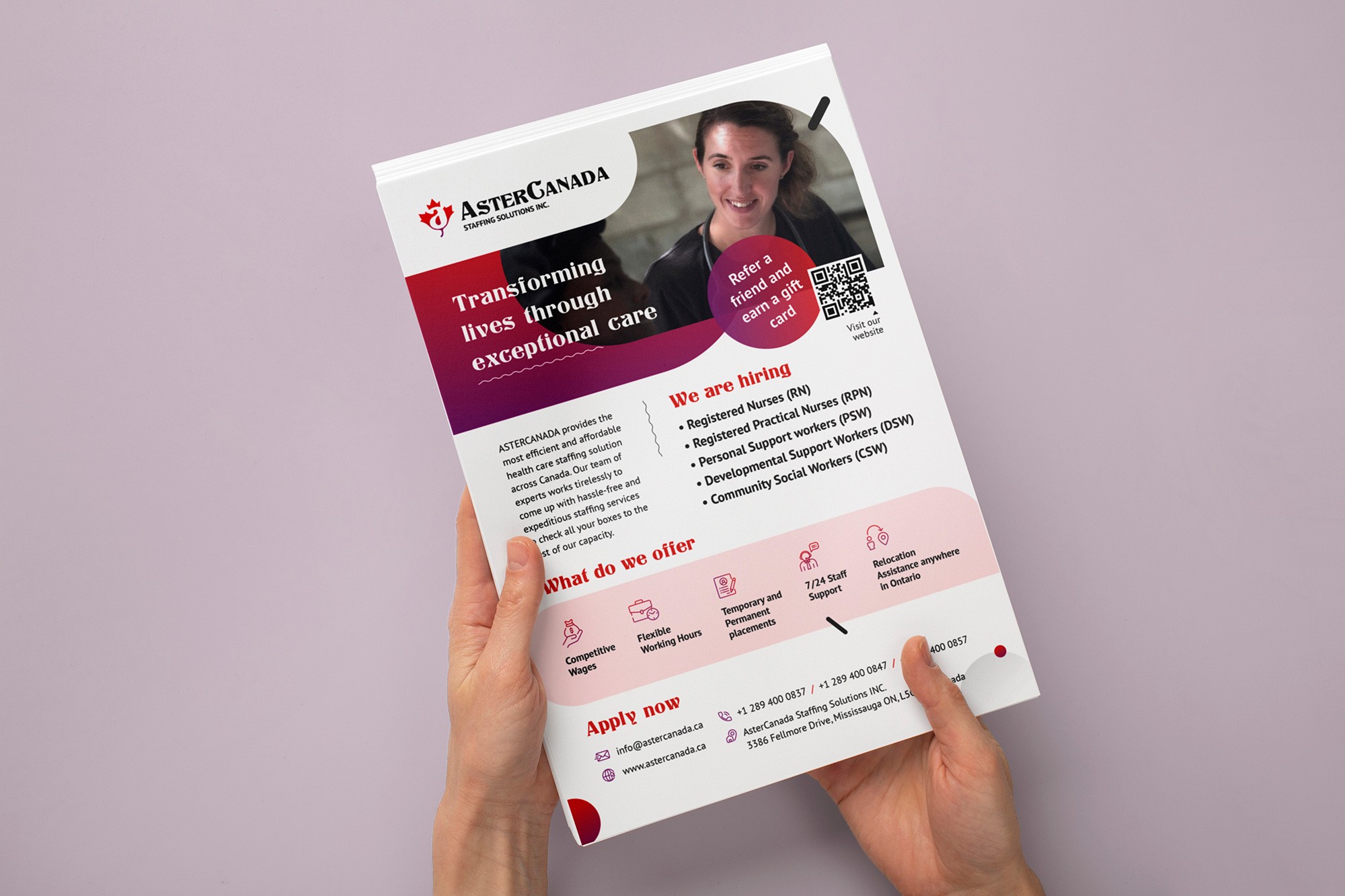
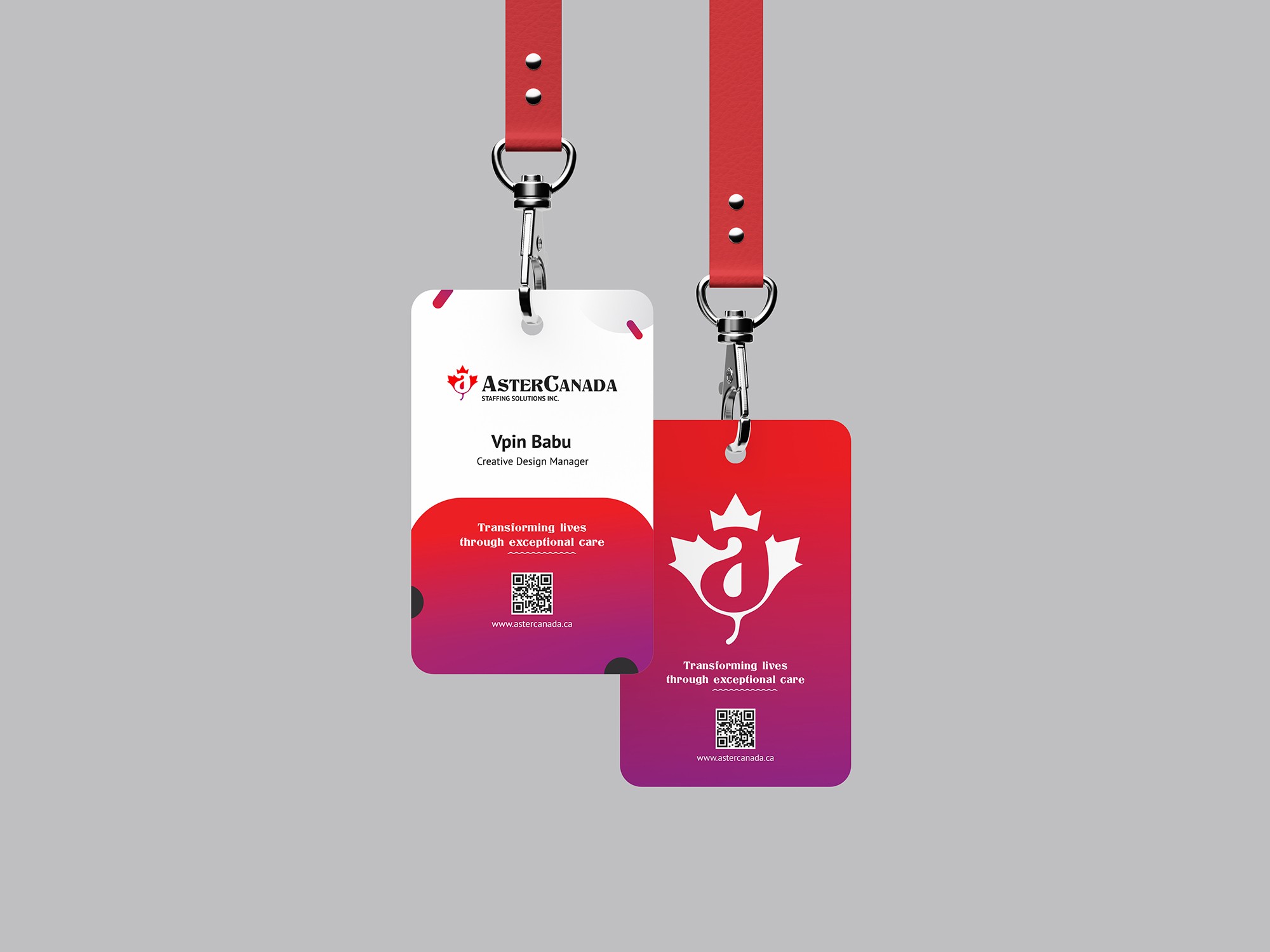
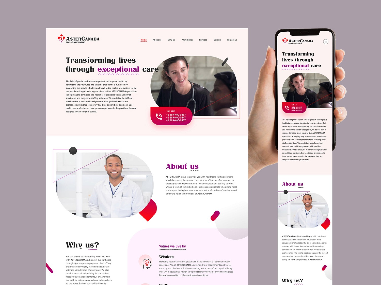
Recently, I was presented with an exciting opportunity to work on a project for ASTERCANADA, which involved creating a logo and other marketing materials such as flyers, brochures, and a website. The client envisioned a logo that would represent Canada in its design while remaining simple. I incorporated the Canadian maple leaf and the letter “A” from “Aster” to create a self- explanatory logo. The gradient colors used are Hot Corail (Red) and Lollipop (Purple), as per the client’s request for an additional color other than the maple leaf red.
In addition to the logo, I also designed a one- page website with six sliding blocks, which met the client’s specifications.
Explore the online website here and please take a moment to review the creatives below.
Overview
ASTERCANADA is committed to delivering healthcare staffing solutions that prioritize convenience and affordability.
Recently, I was presented with an exciting opportunity to work on a project for ASTERCANADA, which involved creating a logo and other marketing materials such as flyers, brochures, and a website. The client envisioned a logo that would represent Canada in its design while remaining simple. I incorporated the Canadian maple leaf and the letter “A” from “Aster” to create a self- explanatory logo. The gradient colors used are Hot Corail (Red) and Lollipop (Purple), as per the client’s request for an additional color other than the maple leaf red.
In addition to the logo, I also designed a one- page website with six sliding blocks, which met the client’s specifications.
Explore the online website here and please take a moment to review the creatives below.